
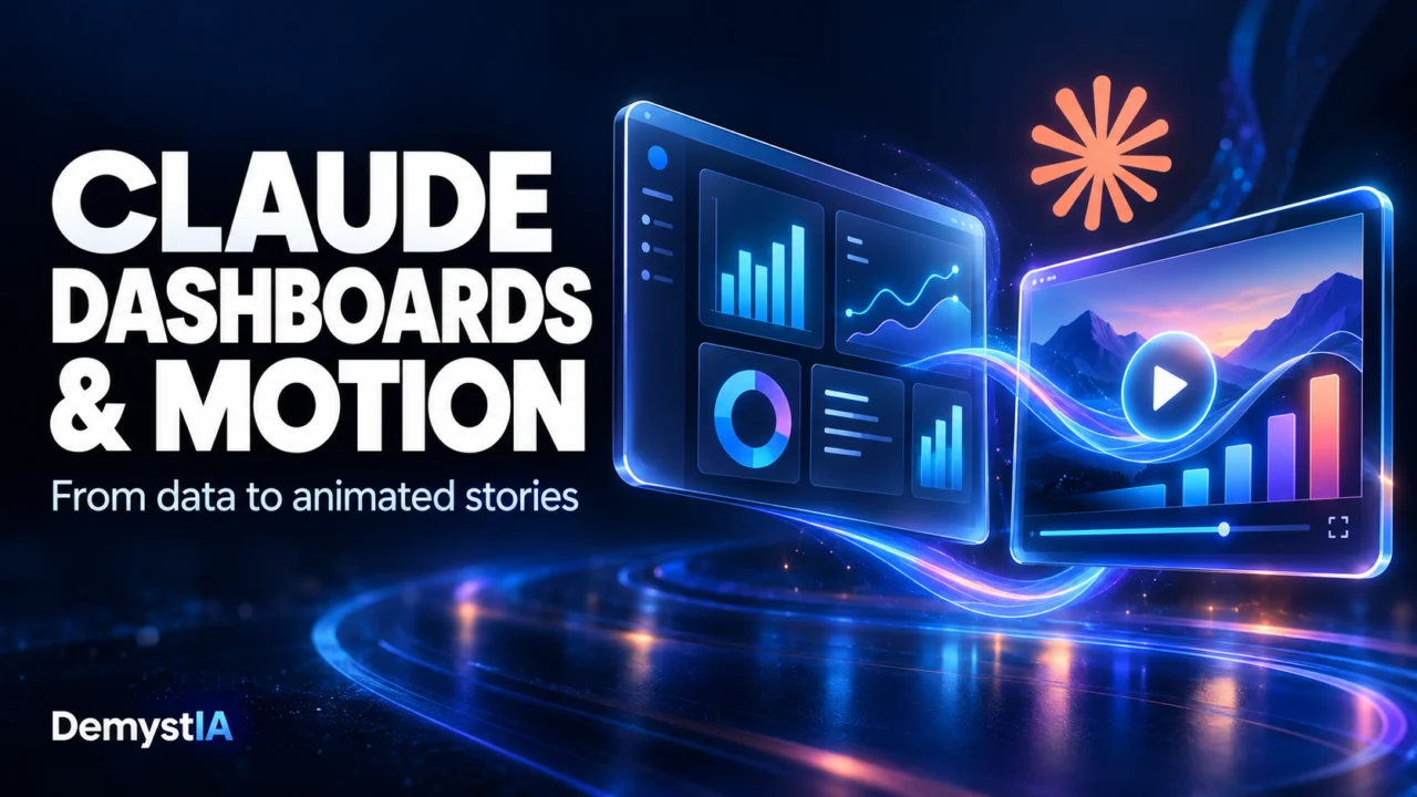
Understanding business data and explaining it to other people are two different tasks. A sales dashboard may reveal a change, but turning that finding into a clear presentation still takes work.
With Claude Dashboards and Claude Motion, announced on October 8, 2026, Anthropic is bringing both tasks into its AI assistant. Dashboards focuses on exploring connected data, while Motion creates editable animations for communicating ideas. Both features are launching in beta.
For businesses, the interesting question is how these tools could fit into everyday reporting—and where human judgment remains essential.
What does Claude Dashboards do?
According to Anthropic, Claude Dashboards connects to platforms such as BigQuery, Databricks and Snowflake, as well as connected applications such as Salesforce. Users describe what they want to examine in ordinary language, and Claude builds a dashboard from the available data.
The company says dashboards can stay current as their underlying data changes. Users can inspect the queries behind the figures and see when charts were last refreshed. Anthropic positions the feature alongside existing business intelligence tools, particularly for exploratory questions.
That distinction matters. Asking a quick question about sales is different from maintaining an official reporting system with agreed definitions, documented calculations and carefully managed access.
Our reading is that the most useful starting point would be a focused question with a result that someone can independently check.
Claude Motion creates editable animations
Claude Motion uses code to animate text, charts, shapes and images. Anthropic says it does not use a video generation model: its output is an animation of supplied content, rather than newly generated footage or people.
The help documentation explains that users can request changes to individual details, including wording, numbers and timing, and export the result as an MP4 video.
For a business presentation, this suggests a practical use: introduce a chart gradually, highlight the period being discussed, and guide the audience through the relevant figures.
Animation should serve the explanation. Moving elements around will add little if the underlying message is unclear.
A practical example: explaining a change in sales
Consider a hypothetical company preparing its monthly sales meeting. Its manager wants to understand why revenue increased while the number of orders stayed roughly stable.
A useful workflow would begin with a precise request:
Compare completed orders and net revenue for the last two full calendar months. Show average order value, separate results by product category, and explain which records you included.
This is an illustrative prompt, not a tested result or a guarantee of what Claude will produce.
Before accepting the dashboard, the manager should check whether refunds, cancelled orders and taxes are treated consistently. An apparent improvement could otherwise come from comparing different definitions of revenue.
Once the figures are validated, the manager could prepare a short animation with three stages:
- Show the change in total revenue.
- Compare order volume and average order value.
- Highlight the product categories associated with the difference.
The presentation should distinguish an observed pattern from an explanation of its cause. Higher average order value does not, by itself, establish why customers spent more.
Which Claude plans include the new features?
Anthropic’s documentation lists the following availability at the time of writing:
| Feature | Status | Available plans |
|---|---|---|
| Claude Dashboards | Beta | Pro, Max, Team and Enterprise |
| Claude Motion | Beta | Team and Enterprise |
| Claude Docs, Slides and Design | Generally available | Free, Pro, Max, Team and Enterprise |
For Enterprise customers, Dashboards and Motion require an organization owner to enable them. The documentation also states that Artifacts require cloud code execution and file creation to be enabled.
A subscription alone therefore does not establish that a particular organization’s data is connected or that the necessary settings are active.
What businesses should verify first
The most important checks concern the meaning of the data.
Define the metric. “Sales” might mean orders placed, invoices issued or payments received. Choose the definition before comparing results.
Check the comparison period. A partial month should not be presented as directly comparable to a full month without an explanation.
Validate a reference figure. Compare at least one important total with an existing report before relying on the new dashboard.
Review the narrative. An animation can make a claim more persuasive without making it better supported. Avoid presenting a possible explanation as an established cause.
The same principle applies to AI-generated explanations with references: readers still need to check whether the evidence supports the conclusion. Our guide to AI answers with sources explains how to make that distinction.
What this means for workplace AI
Our interpretation is that this announcement extends the role of an AI assistant across more of the reporting process: exploring a question, building a visual output, and helping communicate the findings.
For a small team, a sensible first trial would be a recurring report with familiar data and clear acceptance criteria. That would make it possible to assess correction effort, clarity and usefulness against the existing process.
These tools could shorten parts of that workflow. Their value will depend on whether the resulting dashboard and presentation help people reach a sound conclusion—not simply on how quickly they appear.
Sources
- Anthropic — Build live dashboards and animate explainers with Claude, October 8, 2026.
- Claude Help Center — What are artifacts and how do I use them?
This article analyzes Anthropic’s announcement and documentation. The business example is illustrative; it is not a hands-on product test.